DESIGN/ BRAND IDENTITY
This work was created for one of the biggest and most important magazines
in Colombia. The objective was to demonstrate that beyond the quality
of information, its content has an enormous power to reach social impact
and inspire deep changes, that`s why we decided to use a theme
of national interest: Landmines.
in Colombia. The objective was to demonstrate that beyond the quality
of information, its content has an enormous power to reach social impact
and inspire deep changes, that`s why we decided to use a theme
of national interest: Landmines.
SEMANA
MAGAZINE


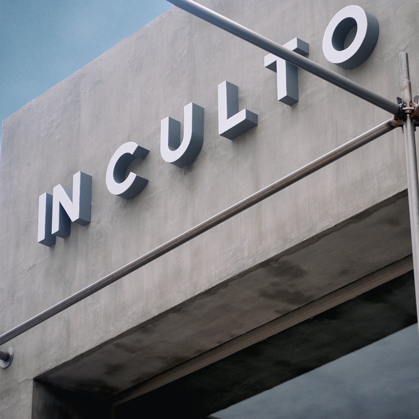
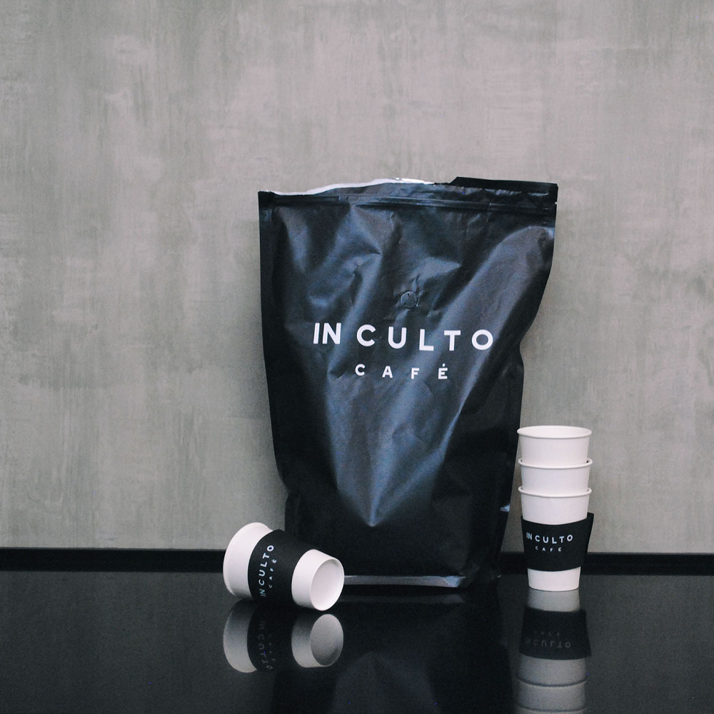
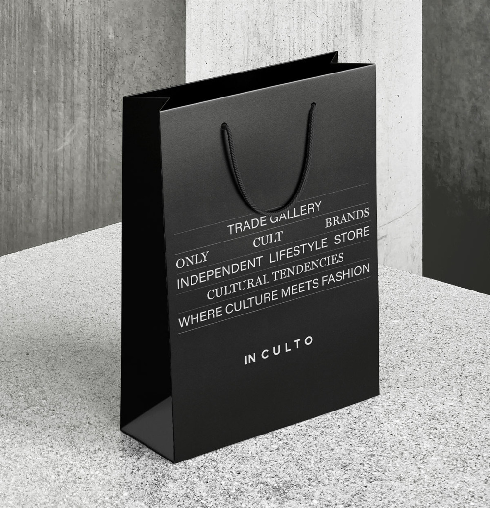
IN CULTO
Inculto is a store conceptualized to offer a unique shopping experience in Bogotá by bringing together coffee, culture, and cult brands in the same space. In this case, the work was from naming and branding to space design.
INCULTO: 1. In Spanish, a person with limited knowledge.
2. Uncultivated land / 3. In (Inside) Cult (culture).
The original font kerning was deliberately modified to allow two different words to be read as a single word (uneducated) or like a phrase (Inside the culture).


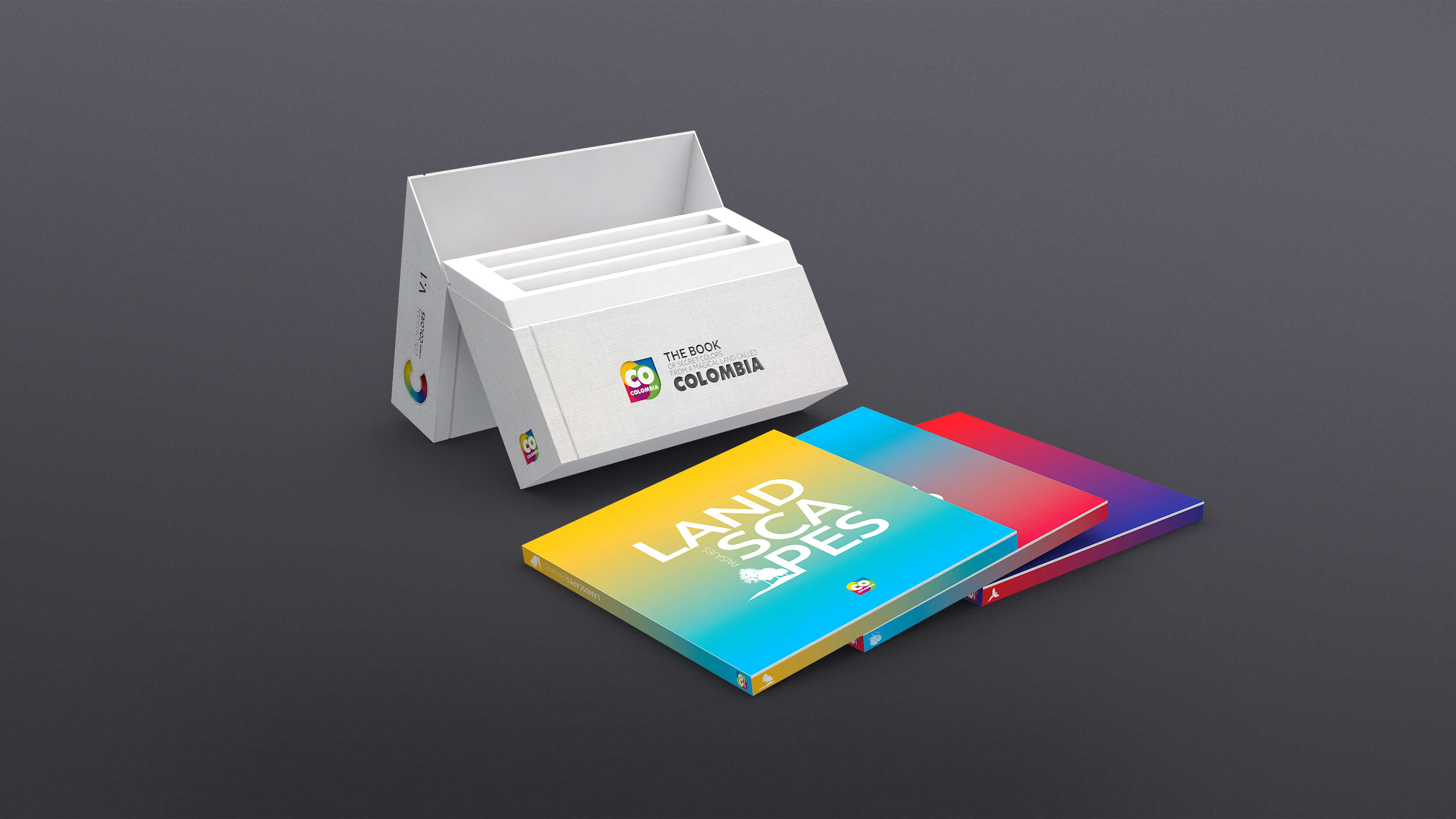
PROCOLOMBIA
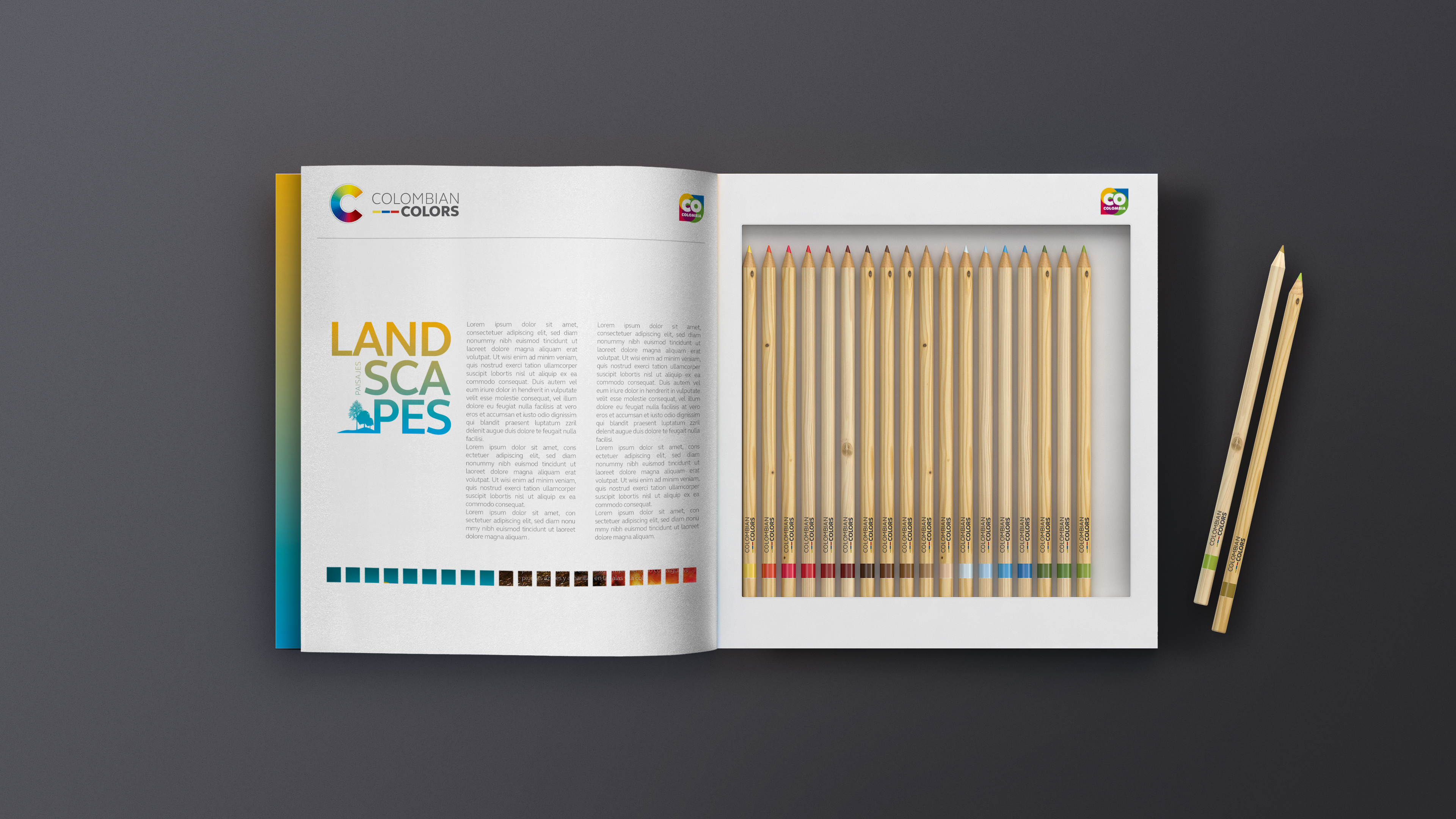
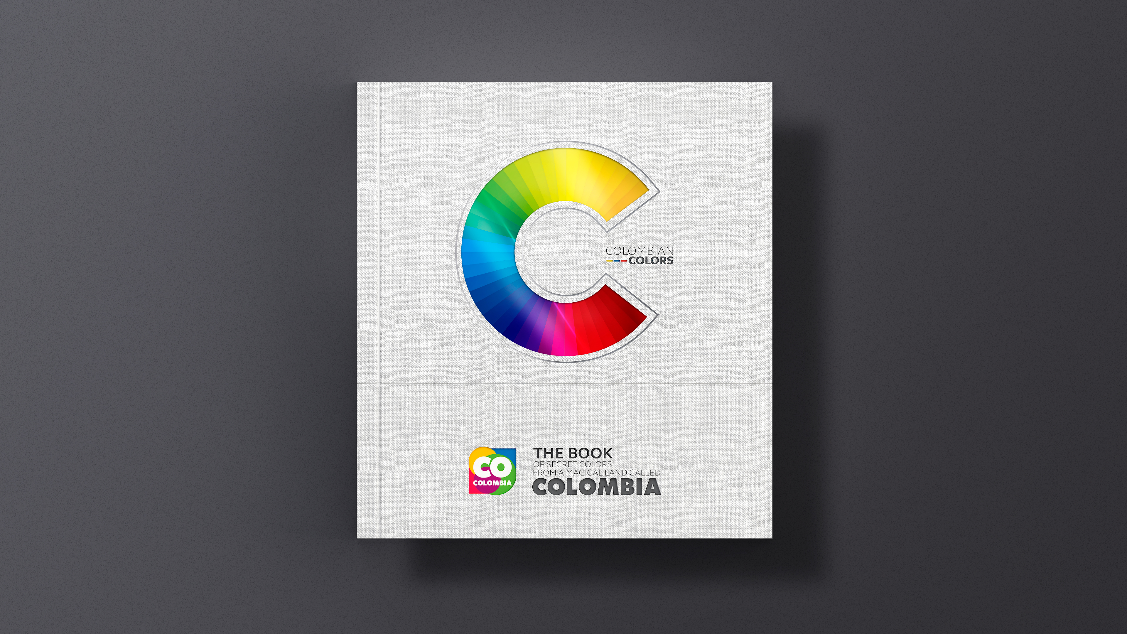
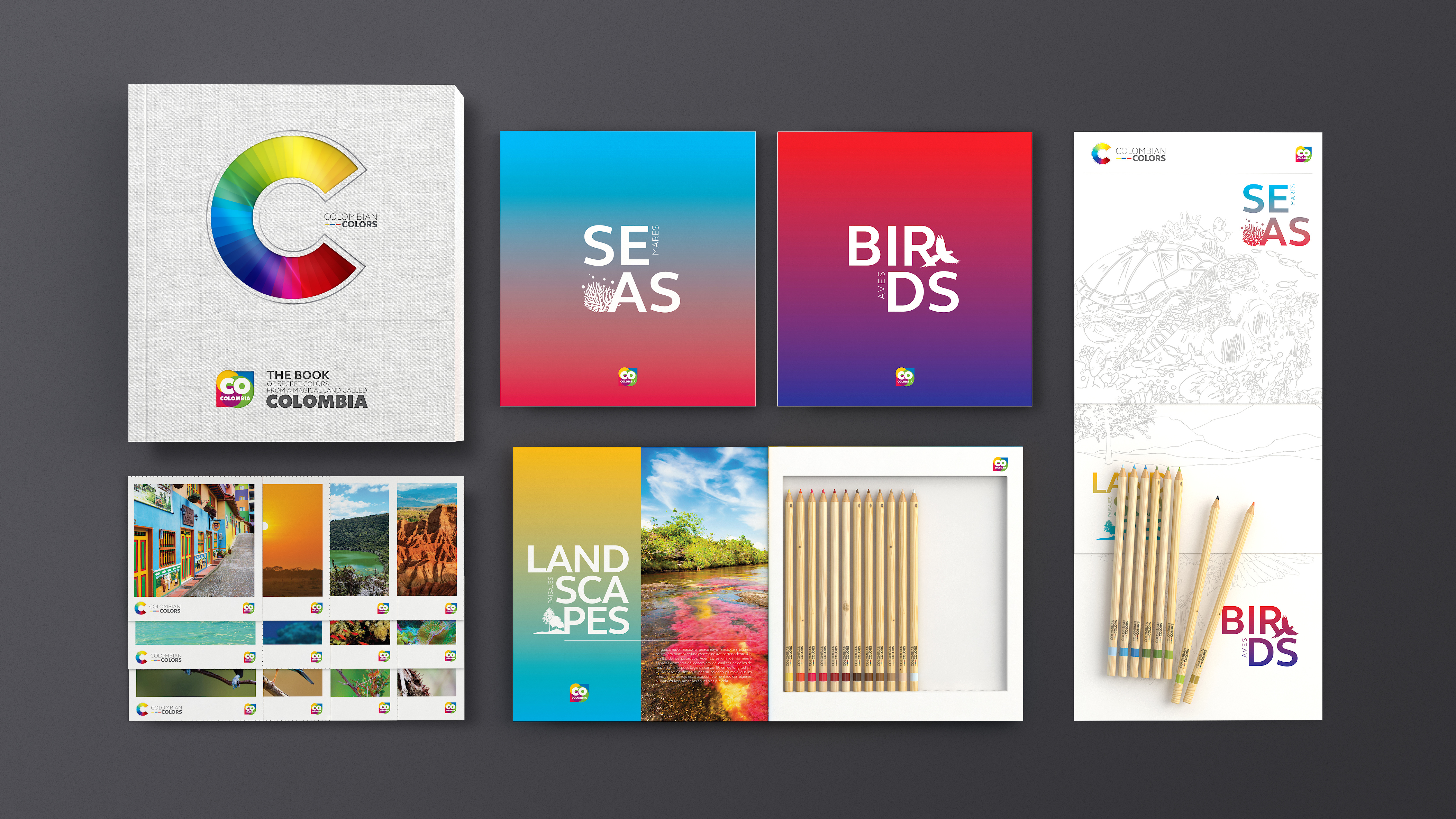
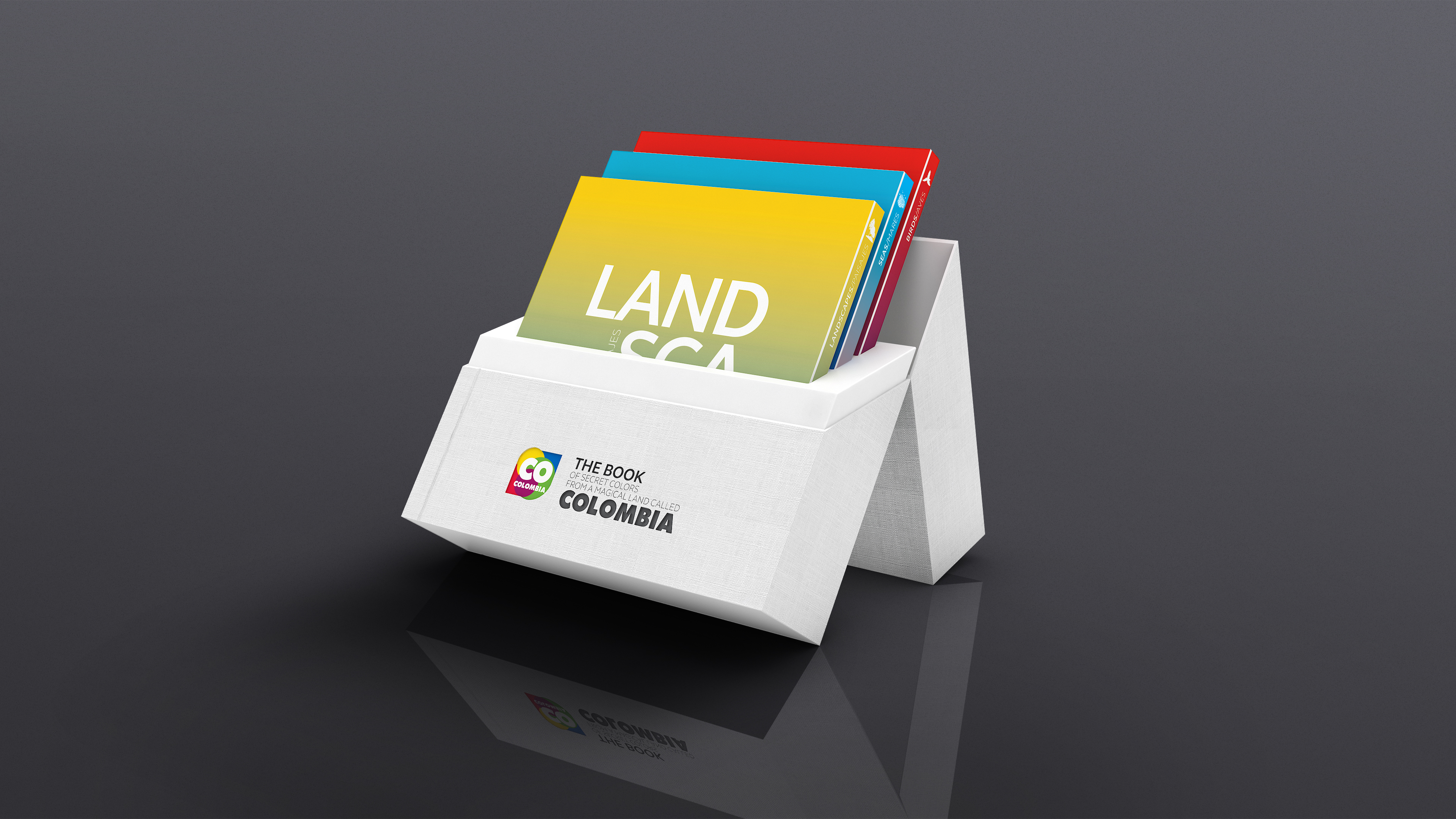
A new way to show the best of Colombia to the world. A collector's book sent to the most influential journalists and opinion leaders of each country. It contained three volumes with the best images of Colombia (beaches, birds, and landscapes) and a set of colored pencils that corresponded exactly to the color palette of one of the images included in the book. It also contains coloring sheets, postcards, and detailed information about all places included.
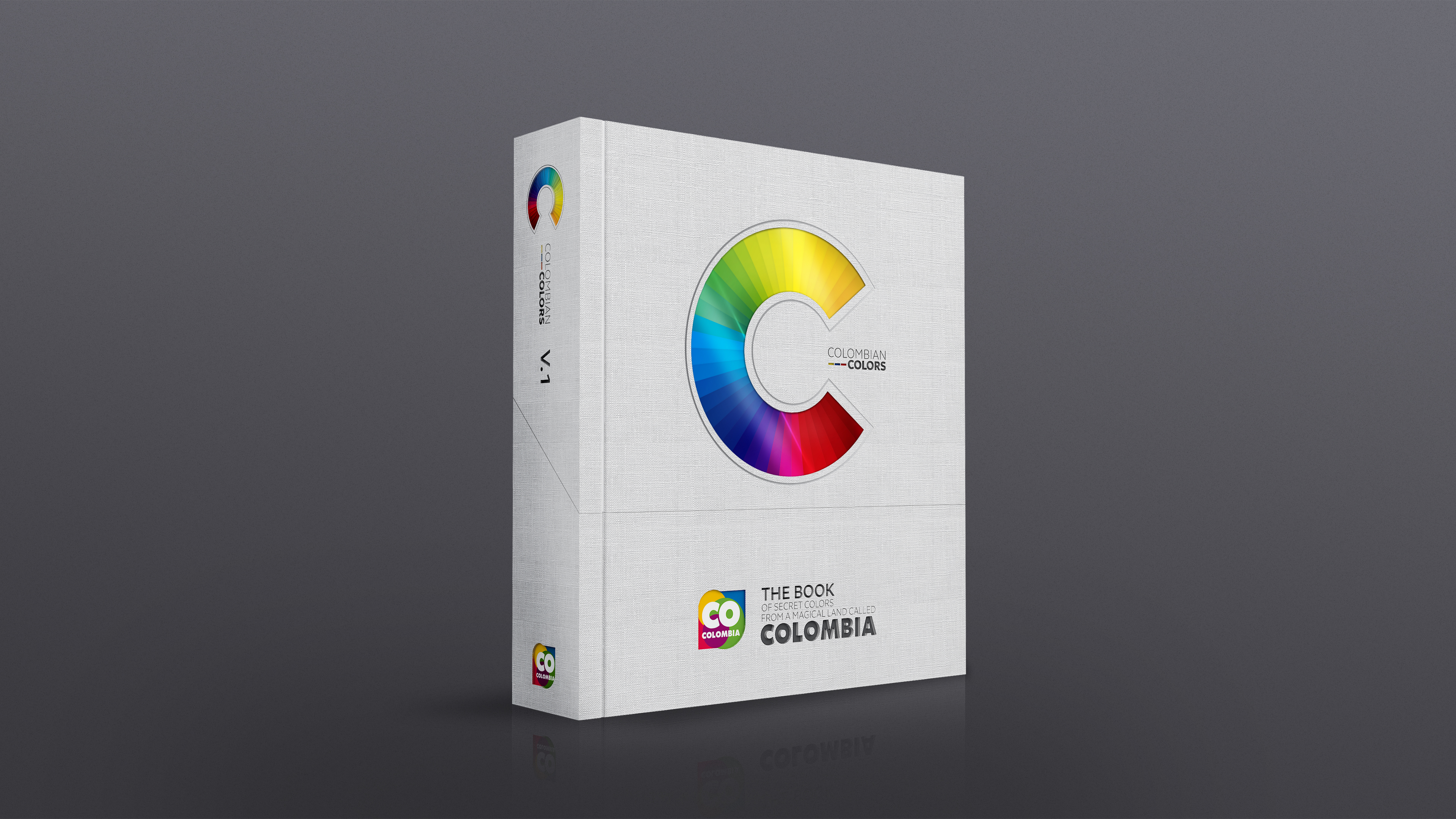

SERREZUELA
A new way to show the best of Colombia to the world. A collector's book sent to the most influential journalists and opinion leaders of each country. It contained three volumes with the best images of Colombia (beaches, birds, and landscapes) and a set of colored pencils that corresponded exactly to the color palette of one of the images included in the book. It also contains coloring sheets, postcards, and detailed information about all places included.


NUMA
Numa is a new brand born in Madrid, Spain, with the idea of accompanying women in the exciting and demanding work of becoming mothers.
A two young mothers venture who decided to share their learnings as mothers and certified coaches, conscious of the value of healthy eating and the limitations of this stage. Numa does everything for them.
A two young mothers venture who decided to share their learnings as mothers and certified coaches, conscious of the value of healthy eating and the limitations of this stage. Numa does everything for them.
The name (Numa) comes from the union of the words woman (NÜ) and mother (MÁ) in the native Chinese language, a culture from which many techniques are applied today to find a balance between body, mind, and soul.
To create its visual identity, we decided to start from the origin of all shapes: the straight lines and curves that mean the masculine and the feminine, and from whose union infinite shapes can be given life, such as the typography created for its logo.The color palette is based on traditional earth tones mixed with vibrant colors to give it a more contemporary look.
TORA
Tora is a new audiovisual content producer for networks led by a woman. A visual identity that summarizes the power of its work.
In this case, we avoid the temptation of constructing a character alluding to her name and delegate that responsibility to the subtle typographic construction of the letter T.


